How to do it FAST & FREE? : Design to Responsive Web Code
You'll learn a revolutionary way to convert your Design into Responsive Web code faster, while saving your time.

In usual Responsive Webpage developing way, Developers are required to convert Design file they adapt from Designer, and have to learn the language to convert design's element into Responsive.
To conclude, it required some extra costs to learn and complete a simple developing stage.
Yes, a SIMPLE developing stage. Because there is simple substitute solution.
Very recently, a few low-code tools have been successfully developed to improve Developers' workflow. But most of the tools never really get enough exposure and trust, mostly because doesn't sounds persuasive enough.
I'm also one who never really believe in this at first. But ever since I give it try...... it might sounds cliche, but, it really changed my original workflow.
A FAST & FREE tool
Been using a Responsive Developing tool called pxCode (www.pxcode.io) lately. What surprised me the most is that it allows me to simply skipped the coding & handoff stage, and with just instinctive visual editing steps, I can complete a well-structured Responsive Webpage.
I first encounter this tool across YouTube, and this general introduction video caught my attention to give it a try. It introduced some major functions within 4 mins, which I strongly recommend watching.
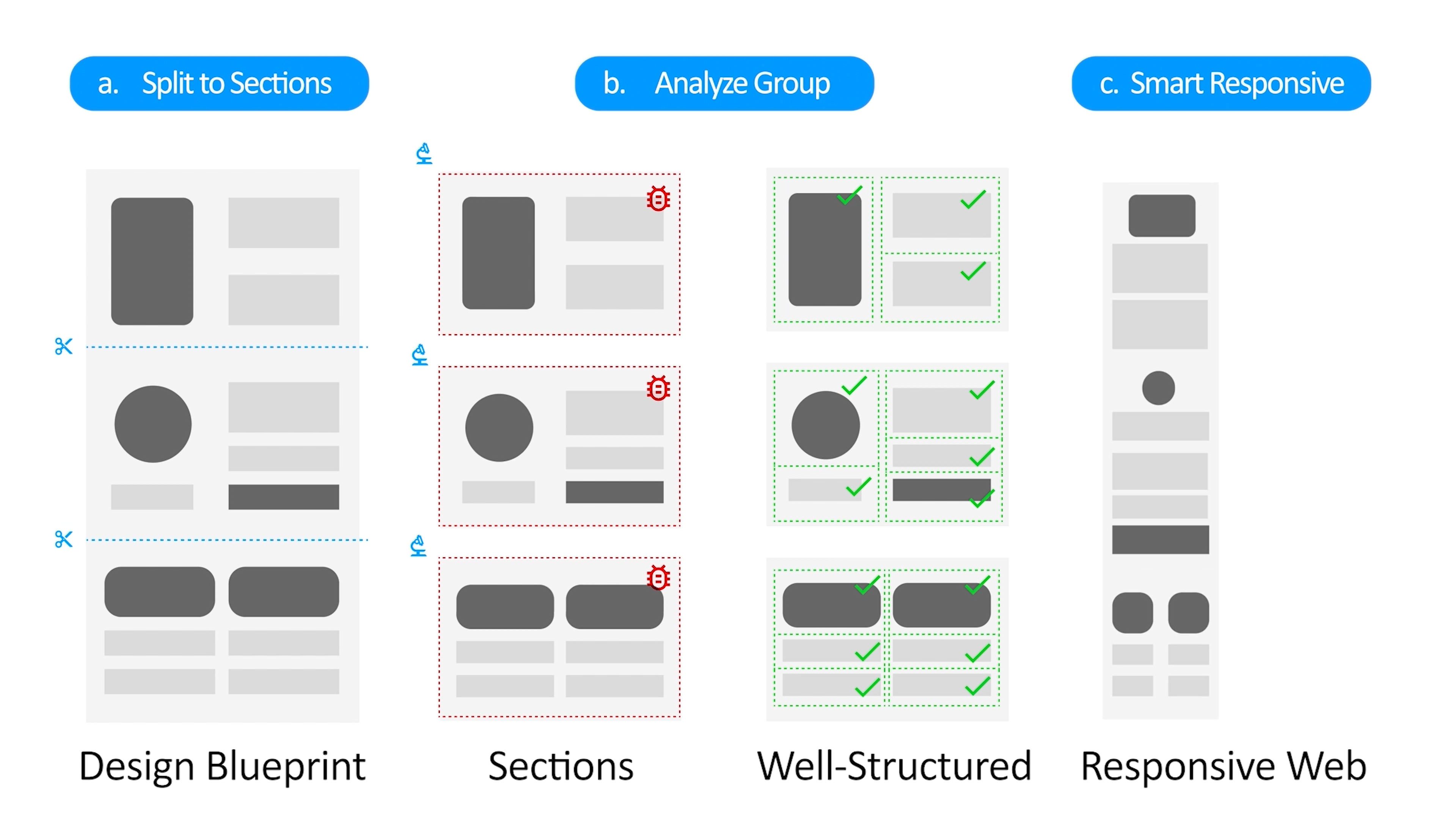
3 Major Editing Steps:
- Split to Sections
- Analyze Group
- Smart Responsive
-
Split to Sections
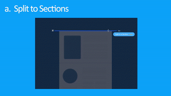
First, [Split to Sections]. In this stage, you can simply & instinctively split your design into sections, in order to have a better and clearer editing interface.
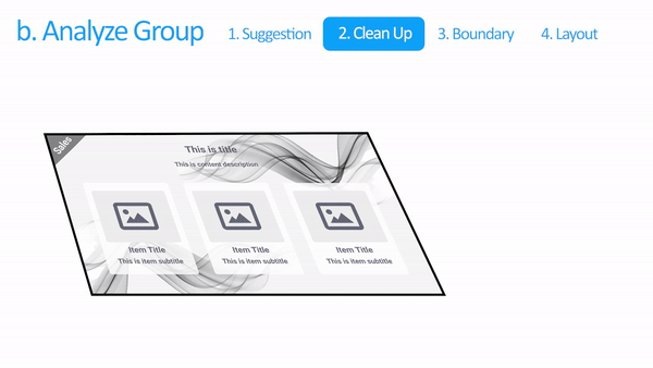
Analyze Group
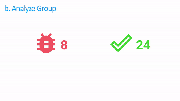
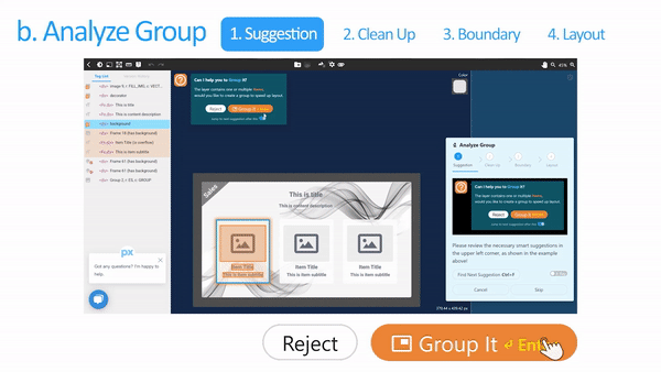
In [Analyze Group]. The ultimate target is to turn all the ‘Buggy Group’ into ‘Well-Structured’ mode.
While [Analyze Group] is the core editing part, it uses four main steps to complete, which are ‘Suggestion’, ‘Clean Up’, ‘Boundary’ & ‘Layout’. Most of the time, pxCode will suggest the possible next editing steps for you.
What you have to do here, is to simply decide the options it provided. For Instance, when you’re into ‘Suggestion’ stage, you'll need to judge if the suggestion is suitable, by clicking [Group It] or [Reject].
In general designs, it was completed by three layers, which are ‘Foreground’, ‘Main Content’, and ‘Background’. Therefore, you'll need to separate them by applying settings for each. It helps to maintain a clean HTML structure.
Lastly, is to apply [Flex Row], [Flex Column], or [Keep as Group] to each content's element, which also affects directly to the HTML structure. Then, pick the main child item in order to enlarge the content.
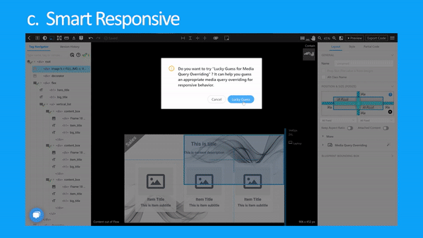
Smart Responsive
It is the final step of pxCode editing. When you complete all the suggestions and received a ‘Congratulations’ badge, pxCode will suggest to apply ‘Lucky Guess’.
It will intelligently apply all the suitable numbers for your responsive content, from ‘Margin’, ‘Text’ and ‘Flex’. Therefore, you can make a decent CSS layout while your design can smoothly respond in any resolutions.
Give it a TRY
I've been enjoying this tool to convert my usual Design to Web workflow, and still discovering more of the features from it at the moment, as they still have plenty to do on the instructions.
But I personally looking forward for it to be more profound in the future. At the moment, the tool is unbelievable but completely FREE! not sure will it make any subscriptions fee, but why not try it now?
- 【Here are the tutorial of pxCode I found】: YouTube: https://www.youtube.com/channel/UCi-NJnon0ROgyX2xdO9y-QA Medium: https://medium.com/pxcode